(970) 927-9668

Peter Campbell seeks to convey an intimate and personal reaction to nature. His oils capture the quiet of dawn and twilight, and the fleeting vibrance of sunset, tapping into the spirit world that lingers in all of us. By limiting his palette and omitting details, Peter effectively creates an atmosphere, a mood, sometimes even a dream-like world which is open to each viewer’s interpretation.
Fleeting glimpses are the spark behind many of Peter Campbell’s landscape paintings. Out of the corner of his eye he will see something that catches his fancy and inspires him to paint. The challenge comes, he says, in trying to transfer that instant response to canvas. “You almost have to fight to hold on to that original idea,” he says. “It takes a lot of work to develop that glimpse into the work you’re trying to produce.” Enjoy this interview with Ann Korologos Gallery and new arrivals from Peter Campbell.
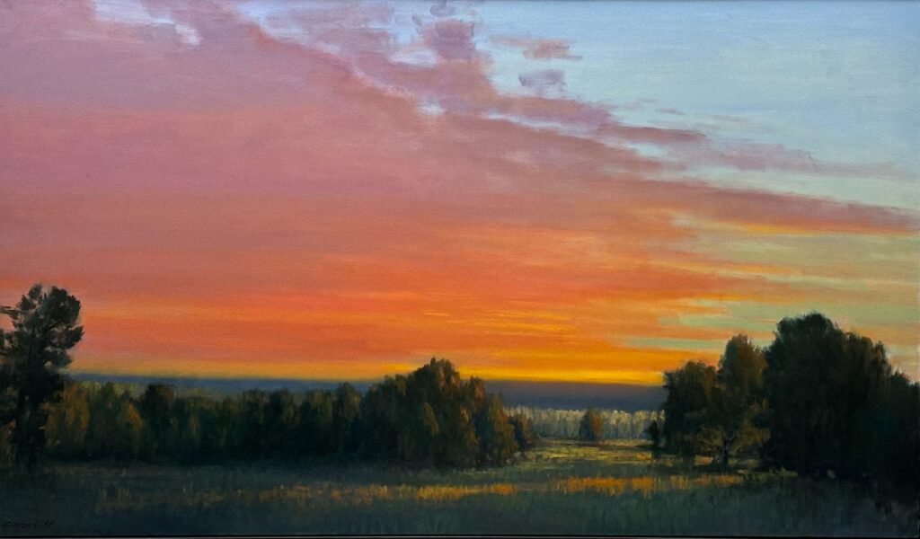
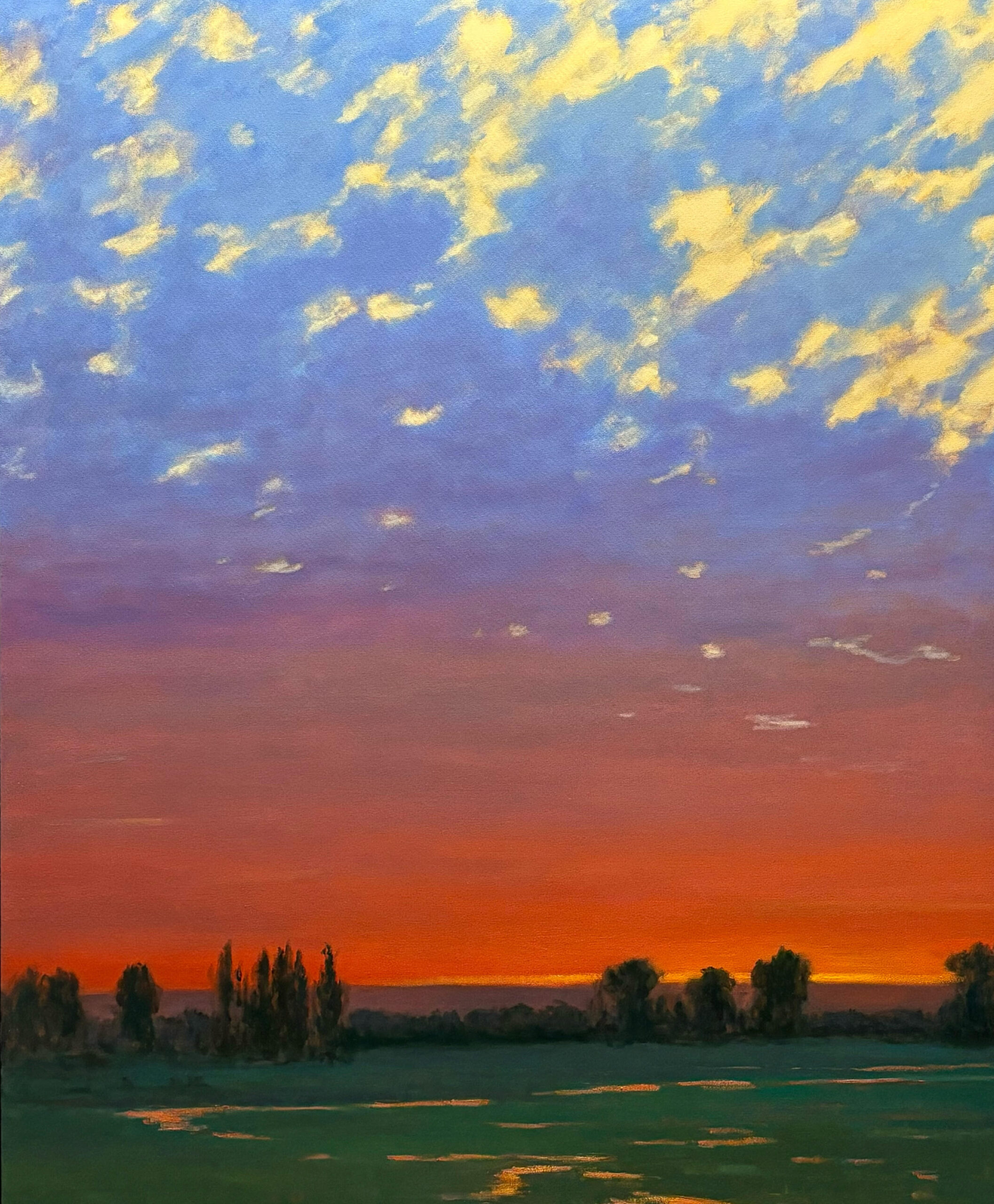
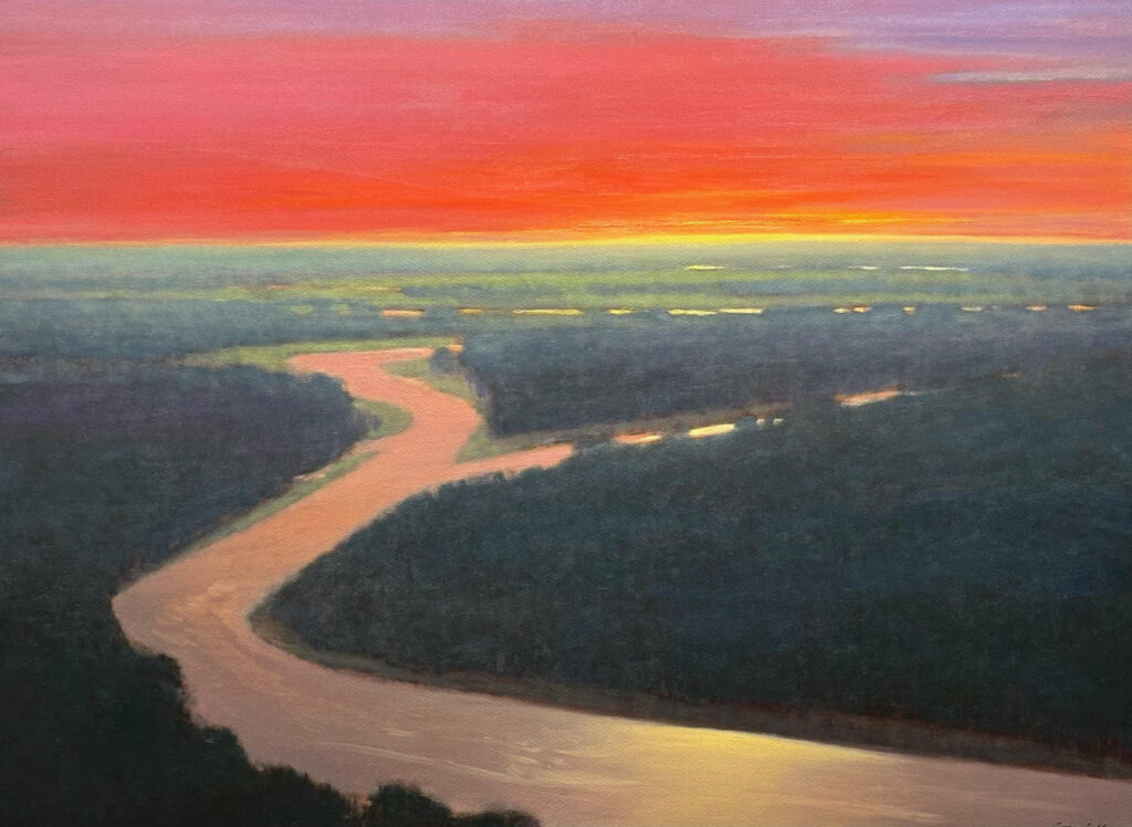
I am drawn to the times of fleeting light because those moments have the richest saturations. When I work on skies, I have some sort of idea in mind but play with the color and shapes of sky elements to create the mood. It’s almost like the color field paintings of Rothko where I can play abstractly with color combinations as they relate to light quality. Skies inspire reflection and appreciation.
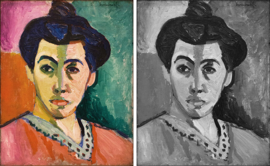
The idea of using black and white as a reference is mostly to get the shapes and dynamic to fit what I am after. Tonality is the real heavy lifter in any painting. You would think it would be color, but that is secondary. I did an experiment with that once in a workshop I taught where I had three different printed photographs of a famous painting. I showed the class each image separately and the paintings were all beautiful and looked the same, but when put side by side it was obvious one had a green cast- one a magenta cast and one a yellow cast. The color in the printing process is never the same as the original. The difference in color didn’t change the tones of the painting, so they all looked fine, but not accurate, further proving that tone is the most important aspect to get right. Matisse has a famous painting called “The Green Stripe,” a portrait of his wife with fauvist color that makes no sense, but it is still a recognizable portrait. If you convert the image to black and white you see how tonality is the key to making things work.
The landscape is always the anchor for the sky. Balancing the drama of a sky can be tricky with the land, and they have to make sense together. Each element plays a part and hopefully can stand alone but together enhance each other.
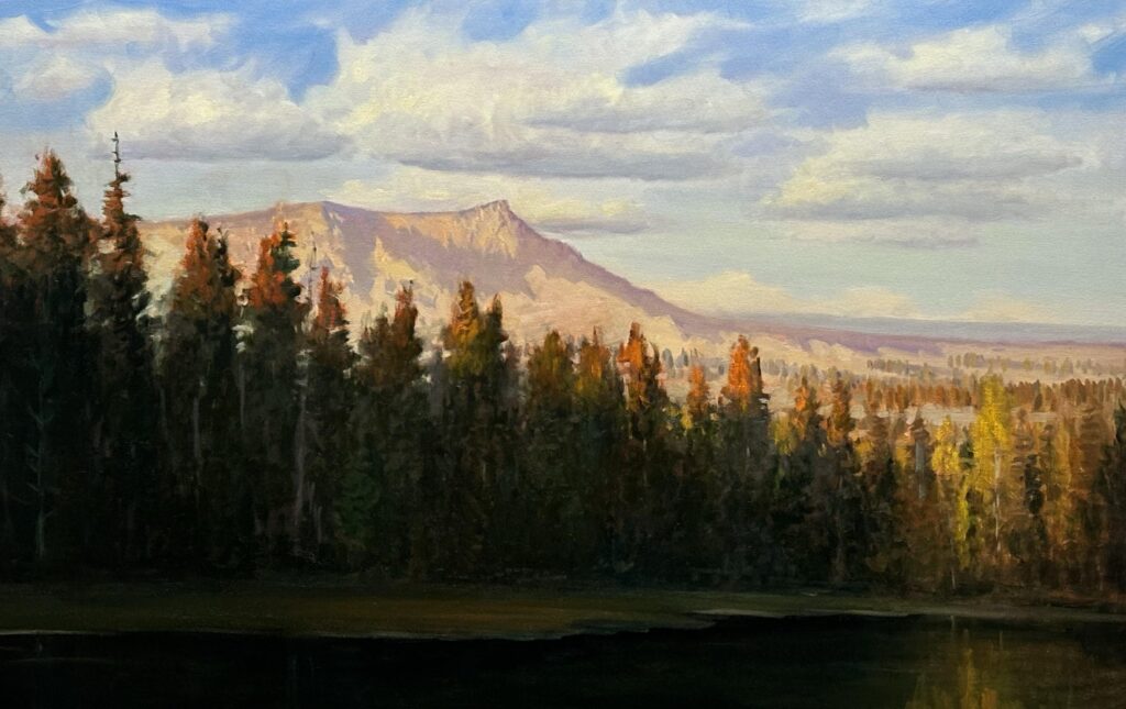
Skies are both subject and mood. It’s interesting how much the sky can dictate our daily emotions: sunrise versus sunsets; grey days compared to vibrant sunny days. Light is always providing a feeling.